UIUX of Designing Retail Spaces

UIUX of Designing Retail Spaces
Imagine a store where the product never changes. Displays are monotonous and uninteresting while rails overflow with crammed hangers. Customers browse lethargically, bumping into each other between tight-fitting spaces.
This doesn't sound like a great shopping experience, does it? Yet this is what shoppers experience when a retail space isn’t designed correctly.
Smart design transforms shopping from a utilitarian activity into an engaging, dynamic experience. And improving the shopping experience can lead to the kind of metrics retailers dream about: increased consumer loyalty, better brand differentiation, higher customer satisfaction, and greater profits.
A Fashion Institute of Technology study concluded that despite e-commerce growth, physical storefronts still comprise 75 per cent of the retail landscape. As such, brick-and-mortar retail must rethink and reinvent its four key elements: assortment, service, navigation and product.
Beyond a purely functional space, retailers must also account for emotional and mental aesthetics.
Psychology plays a pivotal role in interaction design. In order to offer an optimal user experience, you have to empathise with the user and understand their intentions even before they do. This information allows you to conveniently pave a direct path to where they want to go and present your best content in their line of sight.
Shopping should be a fluid, visually exciting and immersive experience, enhancing individual shopping demands. As such, it's essential for retailers to come up with innovative approaches and multiple access points that cater to shifting lifestyles.
The foundation of designing great spaces relies on understanding the behaviour of end users, their needs, and motivations. Sound familiar? User Interface (UI) and User Experience (UX) are two areas that have tremendous potential in the retail sphere.
Definition of UI
User Interface (UI) design encompasses everything that a person may interact with. UI increases a priority on improving customer’s overall experience and is a crucial key element of brand trust.
From a retail perspective, this includes fixtures to displays, products to sales associates. It is the translation of the brand and the visual directive that leads users through their shopping experience.
When designing a retail space, it’s imperative to keep UI in mind when composing space, visual hierarchy, and shopability.
Usability
While some retailers feel keeping stock is a waste of space and time, stuffing all your product onto every rack and shelf in store is counterproductive.
As a designer, usability focuses on making users comfortable on your website. Translated into brick-and-mortar terms, it’s about making the store work well for customers. If a shopper is knocking items off tables maneuvering around ill-placed displays, they will become frustrated and leave.

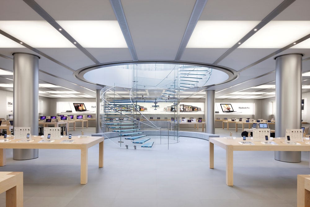
Apple Store Design. Apple uses a lot of white light and presents its products with a lot space between them. The design of the products is replicated in the pure and clean store design.
Space
Have you ever walked through an overly cramped store, bumping into other shoppers? It completely ruins the experience. Personal space is extremely important when designing a store layout.
“Good design is the proper use of space between elements.”
Definition of UX
User Experience (UX) is a more analytical and technical approach. It refers to the emotions and attitudes of a person as they interact with every aspect of a company’s products and services.
Designing a retail store using UX means creating a place that is useful, easy to navigate, and delightful to interact with.
It’s about translating trends and offering products and content to create a definitive and attractive user experience – a holistic customer experience.
Slow them down

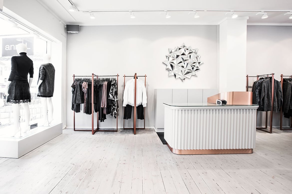
Sass & Bide Store in Australia. Unexpected visual elements respond to emotional and aesthetic demands of customers.
The section customers first enter a store is known as the “transition zone”. Within this area are visual breaks – signage, seasonal displays, etc – referred to as “speed bumps”.
These groupings are not haphazard, but rather play an important role in helping shoppers visualise how products go together. This isn’t purely done for a monetary reason (though, ultimately, that is the goal) but to also tell a story and make the customer feel more connected to your merchandise and your brand.
It should go without saying that this area and all its displays should, at the very least, be kept tidy and refreshed – or completely updated – with some regularity.
Alright, alright, all right
It’s a well-known fact that in America, 90 per cent of consumers tend to start shopping along the right-hand side. Subconsciously or not, retailers must take advantage of this opportunity to make a glorious first impression.
The “power wall” – as it’s often referred to – is the first wall many shoppers notice. Here you should entice and arouse your customer’s attention with a high-impact display.
The path of least resistance
As customers walk throughout your store, it’s important they gain maximum exposure to your products.
From a design aspect, most stores use a circular pathway to the right in order for customers to walk through to the back of the store and then to the front again. This not only increases the chances of them making a purchase, but a well thought-out path can be a great way to strategically control the flow of the traffic in your store. Consider IKEA and its clearly designed floors, guiding customers to the next area.
“It’s about making the small things unforgettable.”
Embracing UI and UX
As customers become more sophisticated and retailers compete more fiercely for market share, it’s imperative a particular aesthetic must be retained.
Though generally associated with the online world, UI and UX are also extremely important in the real world. When used correctly to design physical spaces, these visual and experiential interactions make shopping convenient and satisfying for the customer.
UI and UX are not only about technology, but about understanding consumer behaviour in the offline world.

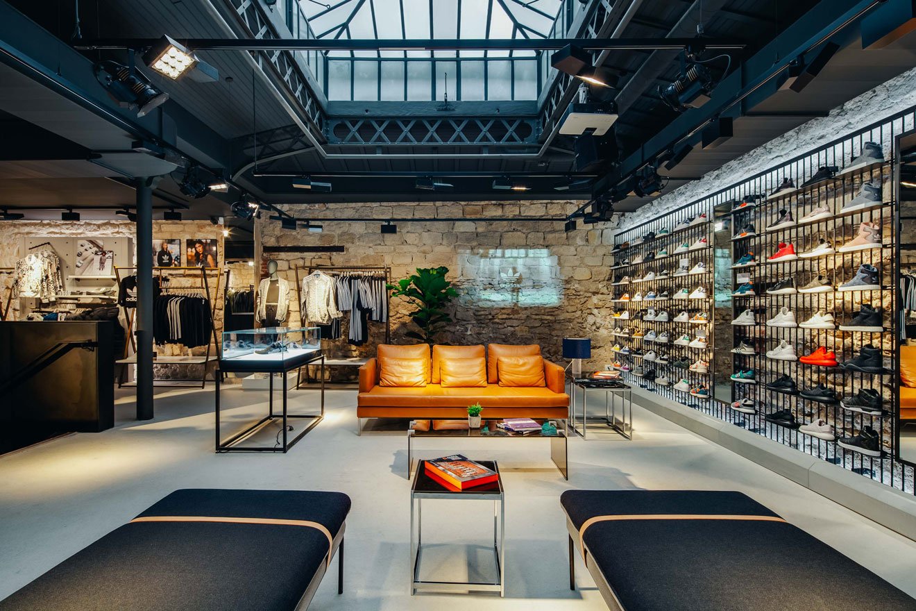
Adidas Originals Flagship Store in Paris. Space between products is used by implementing pleasant interior to create a place where customers feel welcome and comfortable.
About Tom Van Soest
Tom Van Soest is the CEO of Visual Retailing. Having worked in the fashion and retail industry for decades, Tom focuses on empowering brands and retailers achieve a smarter working framework through technology and a cohesive vision.
Never miss out on latest news in the retail industry on Facebook, LinkedIn or Instagram.
MORE ARTICLES BY THIS AUTHOR

Tom Van Soest


