5 Most Important Elements of Visual Merchandising

5 Most Important Elements of Visual Merchandising
Creating a compelling visual concept to advertise your brand, product or services takes a series of complex planning, development, and analysis so you could come up with the best visual solution to display you offer to consumers. Whether you're new to visual merchandising or you're looking for a way to improve your skills here are the five more important elements you need to take into account if you're looking for high-end results.
1. Landscaping
This element can help you add more dynamics into your visual presentation simply because landscaping allows you to manipulate objects in 3 dimensions so you can create a perfect composition. Depending on your needs there are symmetrical and asymmetrical composition techniques that you can use to highlight different aspects of your offer.
Symmetric composition allows you to captivate consumers' attention in full and allowed them to absorb the full spectrum of your product or service. Let's say you're running a professional essay writing service and you want to allow the audience to notice all the elements of your offer. This is where you use symmetric composition.
Asymmetric composition allows you to highlight the most important aspect of your Offer. This way you can present your product in a way that allows you to build expectations with the viewer. For example, raising a product above other products in a stairway composition puts the top product or feature at the peak of the user’s interest, thus emphasizing its importance for the customer.
2. Texture
Through different texture, you can highlight certain aspects of the product or create a sense of compactness by using complementary texture solutions.
The choice of texture also depends on whether you like to create a more joyful or elegant vibe which is also determined by your niche and what you wish to display to your consumers. It's also extremely important to keep your mind fixed on current industry trends and available analytics that display how your dark target audience reacts to certain textures or any other element for that matter.
A grainy texture will grab lights and create a warmer atmosphere while flat texture gives out how much lighter vibe and works well if you're goal is to major viewers feel enthusiastic. Through the smart use of different textures, you can showcase the main object or the star of your presentation and make it easier to be noticed by the audience.

3. Colors
The choice of color represents one of the most important elements of visual merchandising and any other form of visual presentation. According to numerous studies, we humans are related to colors in a way that differs from most living being here on Earth. Different colors present different emotions, we also associate certain color palettes with different states of mind; so the choice of color should heavily rely on elements such as your brand identity, target audience analytics, as well as business goals that you look to achieve through visual merchandising.
Let's say you are running an online agency that offers term paper help to students from all over the world. You would like to choose colors that radiate a productive, trustworthy, creative, and imaginative vibe. In those terms, you're looking for a mix of blue, purple, and yellow colors. It's also particularly important to understand that there are different types of colors and there are aesthetic postulates that determine which types of colors should or should not be mixed.
4. Text
The first order of business is making sure that your spelling and grammar are without a glitch. Poorly written signs, price tags, as well as any banners you might have in your store, will trigger negative emotions with your consumers and make you appear unprofessional and untrustworthy.
Concerning the textual elements of your visual merchandising strategy, it's important to know that typesetting plays a significant role in this matter, according to the author of “Insideparagraphs”. You should keep your font size consistent an only highlight the most important information such as price or specific time frames in case you're offering a limited-time discount or you're organizing a special event in a certain time frame.
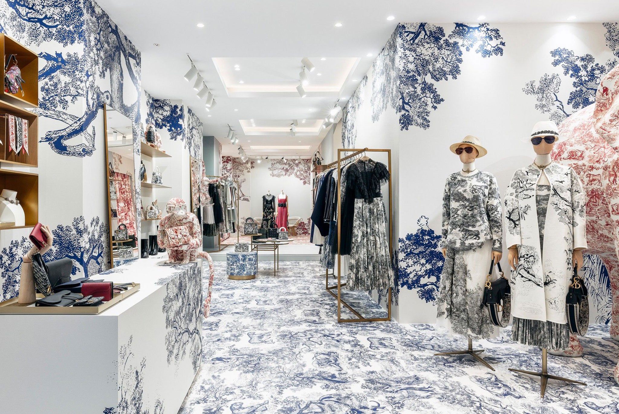
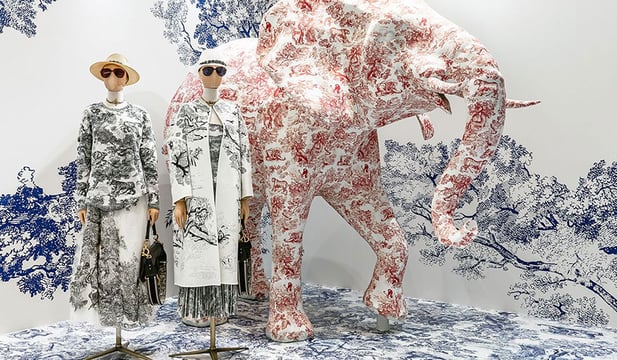
Christian Dior by Est Ailes Interior
5. DECOR
The fifth element is there to enrich your display, provide some personality, or simply drag the attention of the consumer. The most important aspect of any décor is knowing your limits, you should not overflow the merchandise and put it in the shadow of your “bling”.
Different types of décor can be used for diverse purposes. Floral elements can inspire freshness, while wood, dark metal, and gold invoke the feel of elegance and style, as well as quality. Whichever message you wish to send through your décor, make sure it’s not the only thing that consumers will gaze at. After all, it’s only there to add value to your brand and offer.
The human brain is hardwired to react to different stimulants. Our decision-making process heavily relies on visuals, which is why the visual aspect of merchandising is extremely important for the success of most businesses. We hope this article will help you improve your visual merchandising strategy and help your business grow.
Justin Osborne is a writer at term paper help, he loves to share his thoughts and opinions about education, writing and blogging with other people on different blogs and forums. Currently, he is working as a content marketer at professional essay writing service.
MORE ARTICLES BY THIS AUTHOR

Justin Osborne


