Power of senses to enhance visual merchandising

Power of senses to enhance visual merchandising
Visual merchandising is about presenting your retail space in a way that maximizes your sales by focusing on the product. It revolves around the visual aesthetics but the power of senses cannot be ignored as it is a stimulant for the customer’s attention. From captivating storytelling, playing with contrasting heights to engaging the customer over senses, retailers can optimize their merchandising efforts.
It is imperative to understand the customer’s feeling. How will customer feel when walking into the store? Where are those feelings driven from? According to Kevin Roberts, Author of branding book, Lovemarks mentions that “product impressions are made in three seconds.” Three seconds is not a great deal of time to make your product stand out from the thousands of choices customers are bombarded with each day. So, how can you sell your product in three seconds exuberantly? The answer lies in sensory merchandising techniques.
1. Awake all senses together with window displays
Customers sense of sight is generally strong, that’s how they gather the majority of the information as they enter a store. It starts with store layout, product presentation, and visual store branding. Sound and touch can certainly influence customer journeys in store. The ability to sense the products reinforces trust in both product and retailer.

Photo: Crossmarks
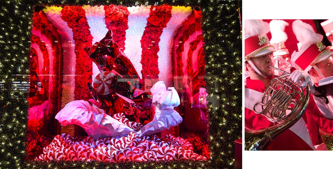
Bloomingdale’s flagship Christmas window in New York captured many eyes with its theme that revolved around the five senses. Visitors got the glimpse of live music, installations, ‘Bloomingdale’s scent’ that was spritzed into the street, activating the senses. This multisensory approach created an immersive environment for the visitors that attracted them to enter the store, expanding the Bloomingdale’s brand identity out onto the high street, beyond the footprint of the store.
2. Create hierarchy in display
Photo: Twitter/Mansur Gavriel
Contrasting heights and depths grab customer interest. Varying heights can fuel interaction among shoppers and products. Give shoppers the opportunity to observe your products from different perspectives. If you find yourself struggling, try using the pyramid principle for product placement ideas and visual hierarchy.
3. Maintain store consistency with colors
Photo: Retail Insider
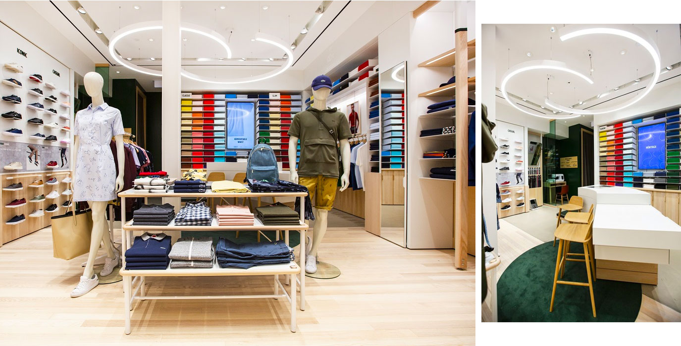
Brand consistency is key- every visual aspect from lighting to the wall paint must reflect the brand values visually. Here, the sense of sight is going to play an important role. Use your brand colors to connect with the customer and generate a sense of trace in their minds. Every color in the store will help you to connect with the brand identity as Lacoste does in its stores.
Sensory experiences should surprise & delight customers, generate emotion and ultimately creates a memory that can be transformed later into sales. It is paramount to provide engaging experience as it brings and shares creativity.
MORE ARTICLES BY THIS AUTHOR

Alice


