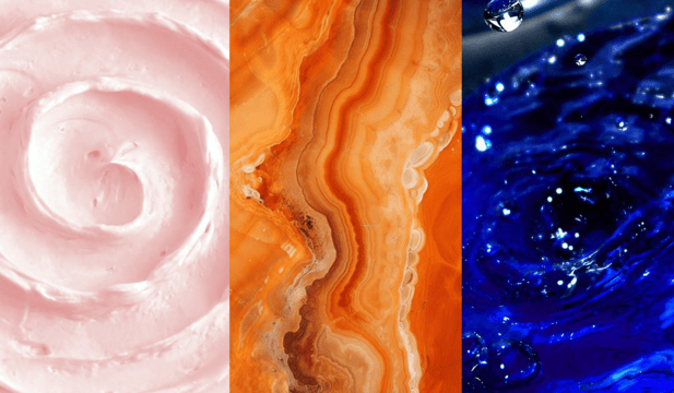
AW 24-25 colors according to @merchandising_trends

AW 24-25 colors according to @merchandising_trends
In a world dealing with economic, political, and environmental challenges, the coming years are an era of uncertainty. It is within this context that color trends will play a pivotal role in influencing consumer choices. The color selections for AW 24-25 will incorporate elements of well-being, environmental consciousness, and technology… while still allowing room for creativity.
Consumers are evolving and actively participating as brand ambassadors. It is therefore becoming crucial for advertisers to foster a sense of empathy in their brand universe by triggering emotions and connection. Color-scheme wise, this can be shown through the adoption of soothing pastel hues that would create an ambiance of serenity and well-being.
In these unstable times, reassuring shades are gaining popularity. A preference for comforting familiarity will be evident through the use of neutral and intermediary tones.
As our hyper-connected world continues to blur the lines between virtual and real, colors that bridge these realities become more and more popular. Ultra-bright and stimulating shades reflect a growing need for creativity, optimism, and imagination.
Let's explore some color references that will undoubtedly feature in your favorite collections for AW 24-25.
APRICOT CRUSH - PANTONE 15-1153 TPX
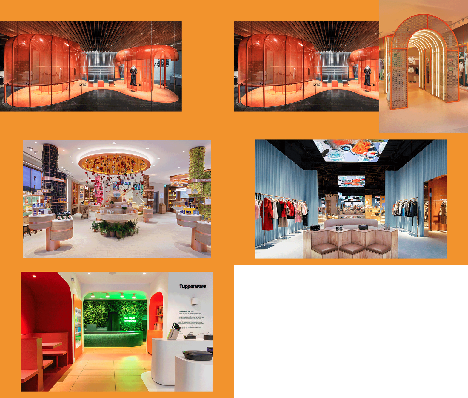
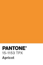 Hailed by trend agency WGSN, Apricot Crush is crowned the color of the year 2024, becoming a central hue for Autumn/Winter 2024/2025. This orange shade, blending vibrancy with delicacy, offers warmth and cheerfulness. Symbolizing hope and positivity, it harmonizes perfectly with both neutral and intense tones. Ideal for adding color, warmth, and brightness, it finds its place in products focused on health, well-being, and luxury.
BRIGHT COBALT - PANTONE 194037TCX
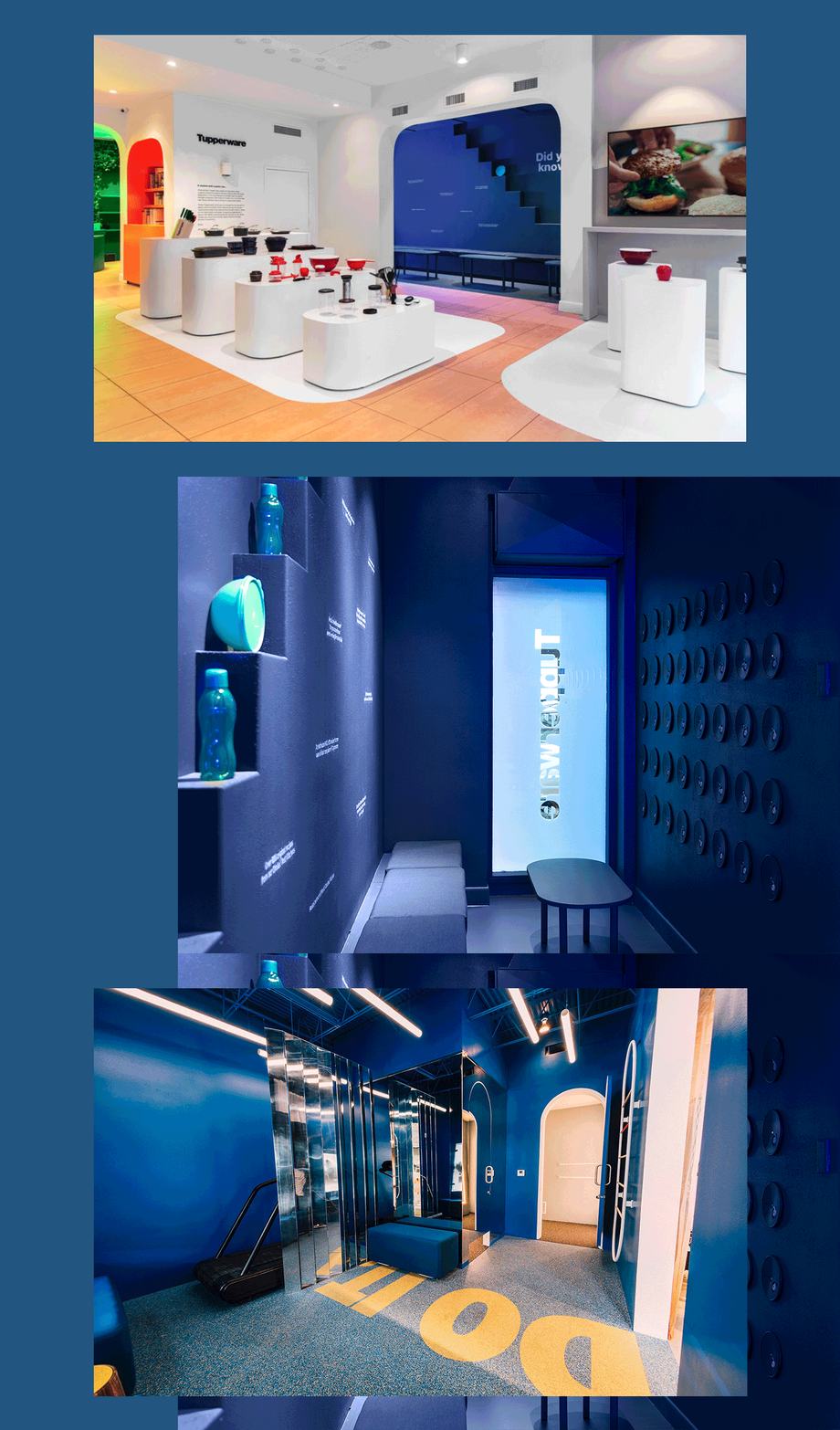
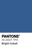 Directly inspired by digital and technological experiences, Bright Cobalt, akin to electric blue, intensifies the desire for escapism and exploration of alternate realities. This shade will stimulate the subconscious to foster optimism and creativity while maintaining a familiar and sustainable environment. Versatile in use, from backlit tech environments to paint, print, or screen applications, this color can be adapted without limitations.
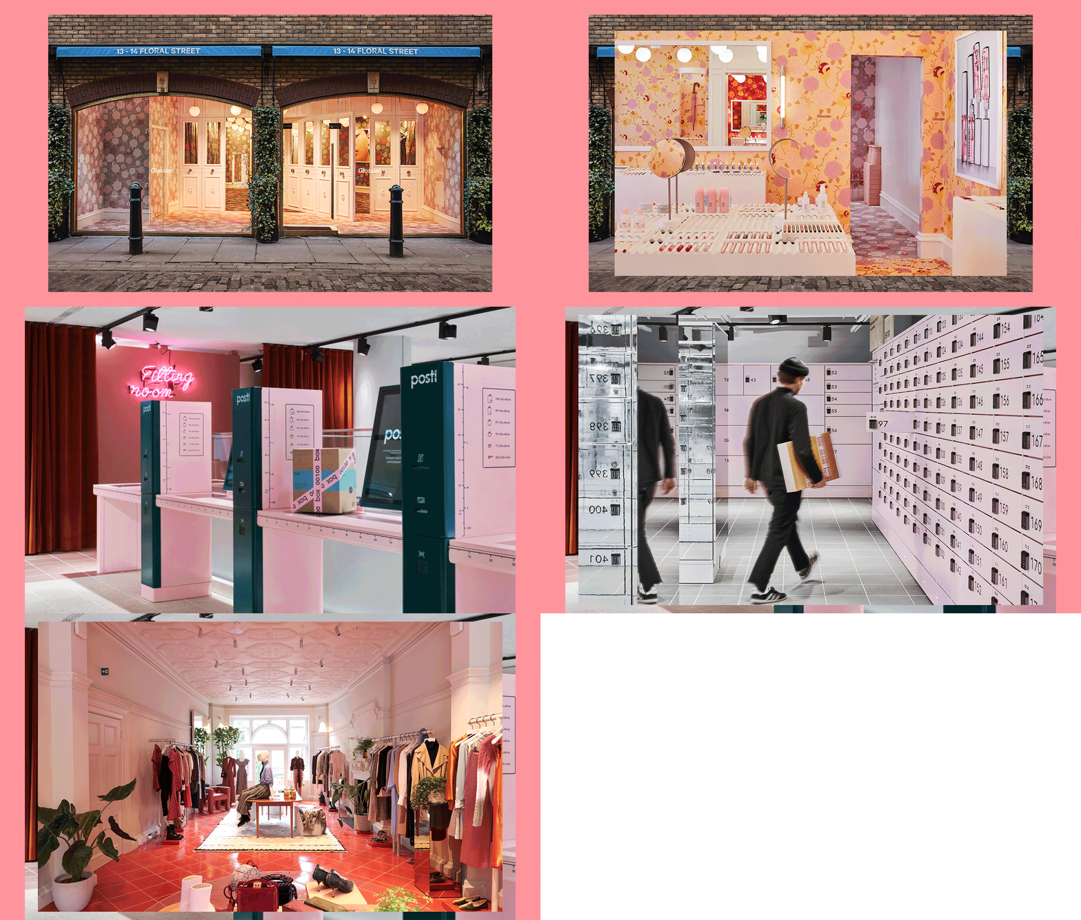
PINK ICING - PANTONE 15-1717 TPX
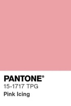 This pastel, unapologetically youthful and charming, assumes the role of a return to soft and soothing nuances. It will ease feelings of anxiety, bringing comfort and fulfillment. These emotions will gain significance in 2024 to strengthen the connection with a community that is decidedly in search of personal expression and tranquility. Pink Icing establishes itself as an essential color for customization, high-tech, and health/wellness products.
By anticipating these color trends, brands can create unique and captivating experiences. Whether by highlighting the warmth of Apricot Crush, the technological brilliance of Bright Cobalt, or the gentleness of Pink Icing, color choices will define the visual identity of brands and their ability to meet the evolving expectations of consumers, all while maintaining the primary goal: to unite a loyal and engaged community.
Follow IWD on Facebook, LinkedIn, and Instagram or subscribe to our newsletter.
Pictures from moodmedia, nellyrodi, fubiz, echochamber, leatherfashiondesign, glassdoor...
MORE ARTICLES BY THIS AUTHOR

Christophe Musialak
With significant professional experience gained from working with leading point-of-sale marketing manufacturers in France, Christophe Musialak has developed his technical skills and retail culture by working daily with renowned players across various sectors: from mass retail to luxury houses. In 2019, he created his Instagram account @merchandising_trends to share, as the name suggests, his passion for merchandising and the trends that inspire him.

